
pinterestĄ─Ų┘▓╝┴„▓╝Šų’L├ę┴╦š¹éĆ╗ź┬ōŠWŻ¼ŲõīŹė├CSS3║▄╚▌ęūīŹ¼F▀@éĆą¦╣¹ĪŻ┼┼┴ąĒśą“▓╗╩Ūé„ĮyĄ─Å─ū¾ĄĮėę╚╗║¾š█ąą┼┼┴ąŻ¼Č°╩ŪŽ╚Å─╔ŽĄĮŽ┬╚╗║¾į┘Å─ū¾ĄĮėęĪŻŽ┬├µŠ═Įo│÷īŹ¼FĄ─┤·┤a║═ą¦╣¹łDŻ║
ą¦╣¹łD╚ńŽ┬Ż║
┤·┤a╚ńŽ┬Ż║
<!DOCTYPE HTML>
<html>
<head>
<meta http-equiv="Content-Type" content="text/html; charset=utf-8">
<title>▓╝Šų</title>
<style>
ul{
/* Ö┌īÆČ╚ */
-webkit-column-width:160px;
-moz-column-width:160px;
-o-colum-width:160px;
column-width:160px;
/* ā╔Ö┌ų«ķgĄ─ķgŠÓ */
-webkit-column-gap:1px;
-moz-column-gap:1px;
-o-column-gap:1px;
column-gap:1px;
}
li{
background:#0CF;
border:#069 1px solid;
display:inline-block;
width:150px;
margin:5px 0;
}
</style>
</head>
<body>
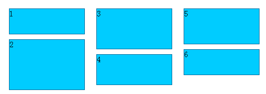
<ul>
<li style="height:50px">1</li>
<li style="height:100px">2</li>
<li style="height:80px">3</li>
<li style="height:60px">4</li>
<li style="height:70px">5</li>
<li style="height:50px">6</li>
<li style="height:100px">7</li>
<li style="height:80px">8</li>
<li style="height:90px">9</li>
<li style="height:30px">10</li>
</ul>
</body>
</html>